Hello Everyone Today we are back with New widget which is Top 6 cute social follow buttons widgets for blogger CSS. Today we know the power of Social Media it helps for every business to grow. So To become a big Company or Website you need more and more followers. if you have more followers there is more chance for your articles or content to be shared with more people and high conversions. So For this purpose we have created this widget using only CSS and HTML. So That it will not effect on loading speed of the site. Top 6 cute social follow buttons are very easy to install and use.

What is Top 6 cute social follow buttons Widget?
Top 6 cute social follow buttons Widget consists of 5 social networks logo with with link to your Page or Profile so that the visitors will click and follow your page. this is very light weight and does not effect on loading of the site we have not used JavaScript at all we just use font-awesome icons and replaced it will images for the sake of loading. So it is beautiful, fast and flexible. and can be added to your sidebar or navigation menu etc.
Why To Use Top 6 cute social follow buttons Widget?
Top 6 cute social follow buttons Widget Has Many Features like:
- More Than 5 Designs Available choose your favorite design.
- Pure CSS script is used in this widget So That This widget does not effect on the Loading Speed of the Site.
- This Widget Does not need more space it can be added to Sidebar, Footer or inside the posts also.
- Most Advanced way of animating which is by Using CSS Have been used to create this widget
- This Widget is Very Flexible and Can Be Customize easily according to your theme or Template.
What is new in Top 6 cute social follow buttons Widget?
The Designs are new and fresh. and created by using font-awesome and CSS to style it. This social buttons have new hover and animation effects on hover or animating all the time.
Let Start! How To Add ATop 6 cute social follow buttons in Blogs or sites:
Steps To Add Top 6 cute social follow buttons Widget:
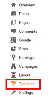
STEP 1: Go To Template Section As Shown in The Image Below
This is Optional Step You must have font-awesome installed in your template for the widget to work.if you have already added this below script then skip this step.
STEP 2: After Clicking on Edit HTML Search for
<head>STEP 3: Copy This Below Code after </head>
<link href='//netdna.bootstrapcdn.com/font-awesome/4.5.0/css/font-awesome.css' rel='stylesheet'/>Now After Installing the script or if you have added the script already you may skip the above step. Now Comes The Important Steps:
Now Adding The Widget Where you want it to be located
STEP 1: Log in to your Blogger account and Go to your Blogger Dashboard

STEP 2: In The Left Side Bar You will find Layout Section as highlighted in the image above Click on Layout.

STEP 3: Click On "Add a Gadget" As highlighted in the image above.
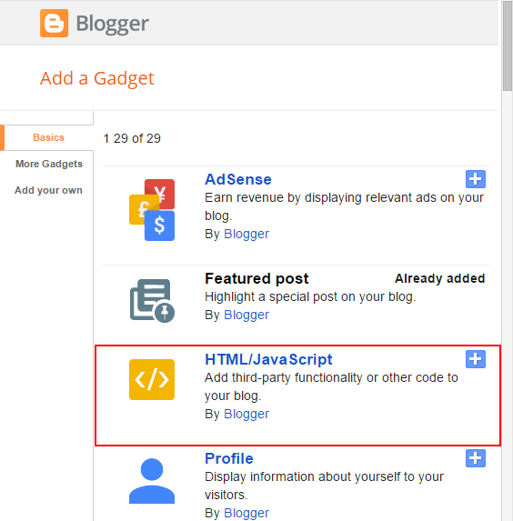
STEP 4:After Clicking on "Add a Gadget" Choose "HTML/JavaScript" from the list
STEP 5: Now Copy This Below Code And Paste it in The Empty Box of the "HTML/JavaScript" Section.
First Design:
<!-- By http://www.trendingwidgets.com/ -->
<div class="social_Wrap">
<a href="Facebook URL" target="_blank" rel="nofollow" class="social_padding unique1"><i class="fa fa-facebook"></i> Facebook</a>
<a href="twitter URL" target="_blank" rel="nofollow" class="social_padding unique2"><i class="fa fa-twitter"></i> Twitter</a>
<a href="Your GooglePlus URL" target="_blank" rel="nofollow" class="social_padding unique3"><i class="fa fa-google"></i> Google+</a>
<a href="Your Feedburner URL" target="_blank" rel="nofollow" class="social_padding unique4"><i class="fa fa-rss"></i> Feeds</a>
</div>
<style>
.social_Wrap{margin: 100px auto;max-width:400px; width: 100%;min-width:300px;}
*{box-sizing: border-box;padding:0; margin:0;}
.unique1 {
color: #fff;
background-color: #337ab7;
border-color: #2e6da4;
border-style: solid;
border-width: 1px;
}
.unique2 {
color: #fff;
background-color: #5bc0de;
border-color: #46b8da;
border-style: solid;
border-width: 1px;
}
.unique3 {
color: #fff;
background-color: #d9534f;
border-color: #d43f3a;
border-style: solid;
border-width: 1px;
}
.unique4 {
color: #fff;
background-color: #EB7E32;
border-color: #f5a056;
border-style: solid;
border-width: 1px;
}
.social_padding {
padding: 5px!important;
display:inline-block;
text-decoration:none;
font-family: helvetica;
margin: 5px 1px 5px 1px;
}
.social_padding .fa {
animation: trendingWidgets 1s linear 0s infinite alternate;
}
@-webkit-keyframes trendingWidgets {
from { transform: rotate(-20deg;)}
to { transform: rotate(30deg); }
}
@-moz-keyframes trendingWidgets {
from { transform: rotate(-20deg;)}
to { transform: rotate(30deg); }
}
@keyframes trendingWidgets {
from { transform: rotate(-20deg;)}
to { transform: rotate(30deg); }
}
a.social_padding:hover {
animation: trendingWidgets 2s linear 0s infinite alternate;
}
</style>
<!-- By http://www.trendingwidgets.com/ -->
Second Design: On Animation Effect
See the Pen Social Buttons Animated by MD M Nauman (@mmnauman) on CodePen.
<!-- By http://www.trendingwidgets.com/ -->
<style>
.social_Wrap li, .social_Wrap li a{color: #000000;font-size: 150%;display: inline-block;}
.social_Wrap ul li:nth-child(1) .fa{color:#425F9C;} .social_Wrap ul li:nth-child(2) .fa{color:#28A9E2;} .social_Wrap ul li:nth-child(3) .fa{color:#D01717} .social_Wrap ul li:nth-child(4) .fa{color:#C72123}
.social_Wrap ul li:nth-child(5) .fa-stumbleupon-circle{color: #EB4822;} .social_Wrap ul li:nth-child(6) .fa{color:#E87B37}
.social_Wrap .fa{
margin:0px 2px;
transition: color 0.5s linear 0s;
list-style:none;
animation: trendingWidgets 1s linear 0s infinite alternate;
}
@-webkit-keyframes trendingWidgets {
from {transform:rotate(25deg;) }
to { transform: rotate(-25deg);} }
@-moz-keyframes trendingWidgets {
from {transform:rotate(25deg;) }
to { transform: rotate(-25deg);} }
@keyframes trendingWidgets {
from {transform:rotate(25deg;) }
to { transform: rotate(-25deg);} }
.social_Wrap .fa:hover{
animation-play-state:paused;
transform: rotate(0deg);
font-size: 160%;
}
</style>
<!-- By http://www.trendingwidgets.com/ -->
<div class="social_Wrap" style='text-align: center; letter-spacing: 2px;'><ul>
<li><a href='your-facebook-url' rel='nofollow' target='_blank'><i class="fa fa-facebook-official"></i></a></li>
<li><a href='your-twitter-url' rel='nofollow' target='_blank'><i class='fa fa-twitter-square'></i></a></li>
<li><a href='Your GooglePlus URL' rel='nofollow' target='_blank'><i class='fa fa-google-plus-square'></i></a></li>
<li><a href='Your Pinterest URL' rel='nofollow' target='_blank'><i class='fa fa-pinterest-square'></i></a></li>
<li><a href='your stumbleupon URL' rel='nofollow' target='_blank'><i class='fa fa-stumbleupon-circle'></i></a></li>
<li><a href='Your Feedburner URL' rel='nofollow' target='_blank'><i class='fa fa-rss-square'></i></a></li>
</ul>
</div>
<!-- By http://www.trendingwidgets.com/ -->
Third Design: On Hover Effect
See the Pen social Button With Hover Effect by MD M Nauman (@mmnauman) on CodePen.
<!-- By http://www.trendingwidgets.com/ -->
<style>
.social_Wrap li, .social_Wrap li a{color: #000000;font-size: 150%;display: inline-block;}
.social_Wrap ul li:nth-child(1) .fa:hover{color:#425F9C;} .social_Wrap ul li:nth-child(2) .fa:hover{color:#28A9E2;} .social_Wrap ul li:nth-child(3) .fa:hover{color:#D01717} .social_Wrap ul li:nth-child(4) .fa:hover{color:#C72123}
.social_Wrap ul li:nth-child(5) .fa-stumbleupon-circle:hover{color: #EB4822;} .social_Wrap ul li:nth-child(6) .fa:hover{color:#E87B37}
.social_Wrap .fa{
margin:0px 2px;
transition: color 0.5s linear 0s;
list-style:none;
animation: trendingWidgets 1s linear 0s infinite alternate;
}
@-webkit-keyframes trendingWidgets {
from {transform:rotate(25deg;) }
to { transform: rotate(-25deg);} }
@-moz-keyframes trendingWidgets {
from {transform:rotate(25deg;) }
to { transform: rotate(-25deg);} }
@keyframes trendingWidgets {
from {transform:rotate(25deg;) }
to { transform: rotate(-25deg);} }
.social_Wrap .fa:hover{
animation-play-state:paused;
transform: rotate(0deg);
font-size: 160%;
}
</style>
<!-- By http://www.trendingwidgets.com/ -->
<div class="social_Wrap" style='text-align: center; letter-spacing: 2px;'><ul>
<li><a href='your-facebook-url' rel='nofollow' target='_blank'><i class="fa fa-facebook-official"></i></a></li>
<li><a href='your-twitter-url' rel='nofollow' target='_blank'><i class='fa fa-twitter-square'></i></a></li>
<li><a href='Your GooglePlus URL' rel='nofollow' target='_blank'><i class='fa fa-google-plus-square'></i></a></li>
<li><a href='Your Pinterest URL' rel='nofollow' target='_blank'><i class='fa fa-pinterest-square'></i></a></li>
<li><a href='your stumbleupon URL' rel='nofollow' target='_blank'><i class='fa fa-stumbleupon-circle'></i></a></li>
<li><a href='your-facebook-url' rel='nofollow' target='_blank'><i class='fa fa-rss-square'></i></a></li>
</ul>
</div>
<!-- By http://www.trendingwidgets.com/ -->
Fourth Design: Grayscale Effect
See the Pen social gray-scale buttons by MD M Nauman (@mmnauman) on CodePen.
<!-- By http://www.trendingwidgets.com/ --><style> .social_Wrap li, .social_Wrap li a{color: #000000;font-size: 150%;display: inline-block;list-style:none;} .social_Wrap ul li:nth-child(1) .fa:hover{color:#425F9C;} .social_Wrap ul li:nth-child(2) .fa:hover{color:#28A9E2;} .social_Wrap ul li:nth-child(3) .fa:hover{color:#D01717} .social_Wrap ul li:nth-child(4) .fa:hover{color:#C72123} .social_Wrap ul li:nth-child(5) .fa-stumbleupon-circle:hover{color: #EB4822;} .social_Wrap ul li:nth-child(6) .fa:hover{color:#E87B37} .social_Wrap li .fa:hover{ transform: rotate(0deg); font-size: 160%; } .social_Wrap .fa { transform: rotate(18deg); -webkit-transition: transform 10s; /* Safari */transition: font-size 2s, transform 0.9s; }</style><!-- By http://www.trendingwidgets.com/ --><div class="social_Wrap" style='text-align: center; letter-spacing: 2px;'> <ul> <li><a href='your-facebook-url' rel='nofollow' target='_blank'><i class="fa fa-facebook-official"></i></a></li> <li><a href='your-twitter-url' rel='nofollow' target='_blank'><i class='fa fa-twitter-square'></i></a></li> <li><a href='Your GooglePlus URL' rel='nofollow' target='_blank'><i class='fa fa-google-plus-square'></i></a></li> <li><a href='Your Pinterest URL' rel='nofollow' target='_blank'><i class='fa fa-pinterest-square'></i></a></li> <li><a href='your stumbleupon URL' rel='nofollow' target='_blank'><i class='fa fa-stumbleupon-circle'></i></a></li> <li><a href='Your Feedburner URL' rel='nofollow' target='_blank'><i class='fa fa-rss-square'></i></a></li> </ul></div><!-- By http://www.trendingwidgets.com/ -->
Fifth Design: colored icons with Animation Effect
See the Pen colored social buttons by MD M Nauman (@mmnauman) on CodePen.
<!-- By http://www.trendingwidgets.com/ -->
<style>
.social_Wrap li, .social_Wrap li a{color: #000000;font-size: 150%;display: inline-block;}
.social_Wrap ul li:nth-child(1) .fa{color:#425F9C;} .social_Wrap ul li:nth-child(2) .fa{color:#28A9E2;} .social_Wrap ul li:nth-child(3) .fa{color:#D01717} .social_Wrap ul li:nth-child(4) .fa{color:#C72123}
.social_Wrap ul li:nth-child(5) .fa-stumbleupon{color: #EB4822;} .social_Wrap ul li:nth-child(6) .fa{color:#E87B37}
.social_Wrap .fa{
margin:0px 2px;
transition: color 0.5s linear 0s;
list-style:none;
animation: trendingWidgets 1s linear 0s infinite alternate;
}
@-webkit-keyframes trendingWidgets {
from {transform:rotate(25deg;) }
to { transform: rotate(-25deg);} }
@-moz-keyframes trendingWidgets {
from {transform:rotate(25deg;) }
to { transform: rotate(-25deg);} }
@keyframes trendingWidgets {
from {transform:rotate(25deg;) }
to { transform: rotate(-25deg);} }
.social_Wrap .fa:hover{
animation-play-state:paused;
transform: rotate(0deg);
font-size: 160%;
}
</style>
<!-- By http://www.trendingwidgets.com/ -->
<div class="social_Wrap" style='text-align: center; letter-spacing: 2px;'> <ul>
<li><a href='your-facebook-url' rel='nofollow' target='_blank'><i class='fa fa-facebook'/></i></a></li>
<li><a href='your-twitter-url' rel='nofollow' target='_blank'><i class='fa fa-twitter'/></i></a></li>
<li><a href='Your GooglePlus URL' rel='nofollow' target='_blank'><i class='fa fa-google-plus'/></i></a></li>
<li><a href='Your Pinterest URL' rel='nofollow' target='_blank'><i class='fa fa-pinterest'/></i></a></li>
<li><a href='your stumbleupon URL' rel='nofollow' target='_blank'><i class='fa fa-stumbleupon'/></i></a></li>
<li><a href='Your Feedburner URL' rel='nofollow' target='_blank'><i class='fa fa-rss'/></i></a></li>
</ul>
</div>
<!-- By http://www.trendingwidgets.com/ -->
Sixth Design: Icons With Hover Effects
See the Pen black social buttons with hover effect by MD M Nauman (@mmnauman) on CodePen.
<!-- By http://www.trendingwidgets.com/ -->
<style>
.social_Wrap li, .social_Wrap li a{color: #000;font-size: 150%;display: inline-block;}
.social_Wrap ul li:nth-child(1) .fa:hover{color:#425F9C;} .social_Wrap ul li:nth-child(2) .fa:hover{color:#28A9E2;} .social_Wrap ul li:nth-child(3) .fa:hover{color:#D01717} .social_Wrap ul li:nth-child(4) .fa:hover{color:#C72123}
.social_Wrap ul li:nth-child(5) .fa-stumbleupon:hover{color: #EB4822;} .social_Wrap ul li:nth-child(6) .fa:hover{color:#E87B37}
.social_Wrap .fa{
margin:0px 2px;
transition: color 0.5s linear 0s;
list-style:none;
}
.social_Wrap .fa:hover{
transform: rotate(14deg);
font-size: 160%;
}
</style>
<!-- By http://www.trendingwidgets.com/ -->
<div class="social_Wrap" style='text-align: center; letter-spacing: 2px;'> <ul>
<li><a href='your-facebook-url' rel='nofollow' target='_blank'><i class='fa fa-facebook'/></i></a></li>
<li><a href='your-twitter-url' rel='nofollow' target='_blank'><i class='fa fa-twitter'/></i></a></li>
<li><a href='Your GooglePlus URL' rel='nofollow' target='_blank'><i class='fa fa-google-plus'/></i></a></li>
<li><a href='Your Pinterest URL' rel='nofollow' target='_blank'><i class='fa fa-pinterest'/></i></a></li>
<li><a href='your stumbleupon URL' rel='nofollow' target='_blank'><i class='fa fa-stumbleupon'/></i></a></li>
<li><a href='Your Feedburner URL' rel='nofollow' target='_blank'><i class='fa fa-rss'/></i></a></li>
</ul>
</div>
<!-- By http://www.trendingwidgets.com/ -->
Customization:
- The Green Highlighted Text is Responsible for your twitter Username So replace all the Green Color Texts with your Twitter Username.
- The Yellow Highlighted Text is Responsible for your Facebook Page Username So replace all the Yellow Color Texts with your Facebook Page Username or URL .
- The Red Highlighted Text is Responsible for your Google Plus Page Username So replace all the Red Color Texts with your Google Plus Page Username or URL .
- The Orange Highlighted Text is Responsible for your Pinterest Page Username So replace all the Orange Color Texts with your Pinterest Page Username or URL .
- The Yellow Highlighted Text is Responsible for your Stumbleupon Page Username So replace all the pink Color Texts with your stumbleupon Page Username or URL .
- The Light-blue Highlighted Text is Responsible For For Your Feedburner Username. if you add the username then only your widget will work correctly. So Change the Text in Blue color with your Feedburner Username.
STEP 6: All Done Save the Gadget and Check it in your site.
That's It Thanks For Following our Tutorial 'Top 6 cute social follow buttons widgets for blogger CSS '' Along With us If you found any difficulty Please Comment and Share Your Valuable Opinion. And Stay tuned for More Tutorials Like This and Share this with your friends.


No comments:
Post a Comment