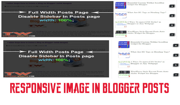
Hello everyone today's tutorial is about making blog posts images responsive as we have seen in many blogs when opening from mobile or other devices the image is same as it was in desktop this looks messy as the image size is desktop site not fitting to the device from which we have opened currently. So I recommend to Add this simple CSS Rule To make All your images responsive on any device. So This is a basic CSS Rule Which we will teach you in this tutorial.

Why To Make Image Responsive?
See In today's world Most of the people visits to your site from smartphone And when they found your site ugly or messy with big images breaking the layout and overlapping the paragraphs. this makes bad impression and the visitors think this site is not official or Good and They will never come back not recommend your site to their friends. So it is necessary to make responsive Site And more importantly the content with images should be responsive.
Why my Images Breaks the layout in other devices?
Yes this is because your blog is not responsive so your images are not fitting to your device as the general CSS rule we apply only width: 600px, 80% etc etc. But On Small devices with Resolution less than 500 the image will break the layout and overlap other widgets and sidebar as you specified larger image than the device so this looks very messy and needs to be fixed as soon as possible.
Let Start! How To Add Disable Text Selection in Blogs or sites:
Steps To Add Disable Text Selection Widget:
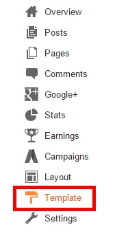
STEP 2: In The Left Side Bar You will find Template Section as highlighted in the image above Click on Template.
STEP 3: Click On Edit HTML.
STEP 4: After Clicking on Edit HTML Search for
]]></b:skin>
STEP 5: Copy This Below Code Before ]]></b:skin>
.post-body img {
max-width:100%;
height: auto;
padding: 0px 1px!important;
}
Customization:
- The Yellow Highlighted Text is Responsible for Height of the image by default we added auto which means the image will not get stretch or not look bad even if you increases the width. it takes height automatically so We Prefer not change this but if you want a fixed height then you can play with this. just change auto with your preferred size with px at the end.
- The Green Highlighted Text is Responsible for Padding of the image so that the image looks good and come to edges so it is optional if you want to remove it you can remove it and if you want to have space around the image then you can increase it. the first 0px is for top and bottom padding and the last 1px is for right and left padding.
STEP 6: All Done Save Your Template and Verify it in your site Whether it is working correctly or not . If it is not working correctly then you did some mistake while following tutorial.
That's It Thanks For Following our Tutorial " Disable Text Selection inside the Blogger Posts using CSS! '' Along With us If you found any difficulty Please Comment and Share Your Valuable Opinion. And Stay tuned for More Tutorials Like This and Share this with your friends.


No comments:
Post a Comment